Evaluation
To show how the device would perform the functions I created a prototype using Adobe Flash. I used one of the designs of the device which has grey pattern on it and tried to make it look as if the device is in user’s hand.
The user is to click on the shape of the device to open it up and press the on/off button to turn the machine on. The device shows the logo on the start up screen and then user walks through the stages of the menu. I have thought of it as if the machine was in my hand and how I would use it. The functionality of the device is very user friendly and to its simplest form.
Overall the prototype gives the look and feel of the product and how it would work.
Design
To design the device for this project I set myself a number of tasks before finalizing the way it should look.
I thought of it as if I was going to actually make the device and what stage it would go through as a publisher and designer. The stages were shown as a part of my second assignment for this module where I started off with the technical side of the device. The functionality and the steps the device would make the user follow. The symbols the maintenance, the precaution the way it performs the results and every little aspect of it.
The final design shape of the WBP device. The final shape came after a research of shapes suitable to be worm.
Reference to Assignment 2 Sketch book.
Then I followed it along the designing stages, the initial step was the shape of the device. Then the font and where on the device the buttons should appear.

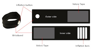
How the wrist band works......
The inflation button makes the bar fill with air which puts pressure to the pulse and the blood pressure is taken.

I spent quite a long time on designing the graphics of the device. Also looked at the material that would best suit the device for various reasons such as the fabric is highly flammable material and so on. For the final look I designed 6 different styles/genre of the device, giving the patient choice to pick their style, did similar for the wristbands. Every style has a reason behind it, like the colours and pattern. For example purple colour for ladies and blue and grey for men.


Logo for the WBP Device.Took the logo through several stages to see which one suits the best for my product. A few changes make a lot of difference the way audience may look at the product, having a background in graphic helped me a lot for this project and I feel as if I covered every feature for developing my chosen proposal/device (apart from the money it would cost).
Achievable Improvements
The machine could have an option of customizing it and to make it more striking it could some simple games as an option, which would surely attract the customers.
Proposal
The proposal was to create a device which would let the patience but independent and would save the time of nurses/doctors. Though the device was to only take the blood pressure results but little things make a lot of difference in life.
This technology was to benefit the hospitals in following ways:
Ø Alerts the doctor at emergency times
Ø Keeps the doctor up to date
Ø Easier way of communication
Ø Fast way of sending the present information/situation of a patient
Ø No hassle for appointments or waiting for a doctor
Ø Regular and convenient way of check up
Ø Easy to use and handle
Ø Confidential
Ø Time saving for doctor and the patient
Thought similar devices exist but they are based on different technologies, such as Bluetooth. My proposal is based on using the blood pressure machine with a pager, as pagers are very familiar to the hospitals for number of years.
On the whole I think the proposal is original and realist. I do see a scope of such a device.


